Sign In
 26.01.2009
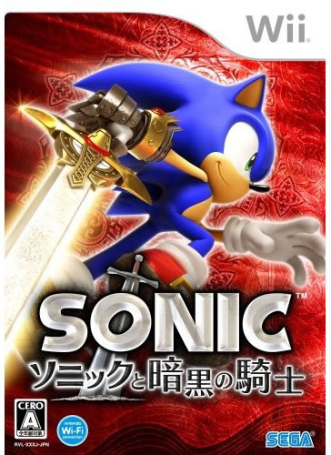
Sega are taking a different approach in box-art for the latest Sonic sidestory for Wii, Black Knight.
The blue hedgehog's European and US artwork is near identical except a little vertical push, but his Japanese design shows the now sword-fighter facing sideways and giving us a lovely smile, awww!
Thanks to All Games Beta.
Better? Worse? Both good/needing improvement?
 Game Details
 Read Review
 Screens
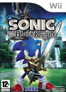
 Out now
  Out now
  Out now
  Out now
  WP-Final
 Link to this post:
 but both still great
 Subscribe to this topic
 Features


 Top
Top