Retailers Reveal Wii U Boxart Designs

By Jorge Ba-oh 08.08.2012 15

Retailers Reveal Wii U Boxart Designs on Nintendo gaming news, videos and discussion

Update: Nintendo confirm designs

Speaking to Kotaku today, Nintendo of America have confirmed the provisional box-art designs posted by retailers this week.

Nintendo has finalized the design of the Wii U game box art, and many of our publishing partners have already incorporated it into their own game packaging. We are seeing those game packages online as retailers are starting to showcase their games. Nintendo-published game boxes will appear shortly with placeholder logos, and then ultimately with the final artwork for each game.

What do you think of the Wii U boxart template and design?

Original story - 09/08

Retail giants Target and Amazon have started to populate their catalogues with potential Wii U boxart. 

The Canadian arm of the popular mail-order chain Amazon lists various games, including Assassin's Creed 3 and Marvel Avengers, with what appears to be the Wii U boxart templates.

The design boasts a GameCube-esque curve at the top in a vibrant blue palette, yellow trim and white panels along the spine - almost a hybrid between the current Wii and its predecessor.

Games with online functionality appear to don the Nintendo Network logo as well.

Image for Retailers Reveal Wii U Boxart Designs

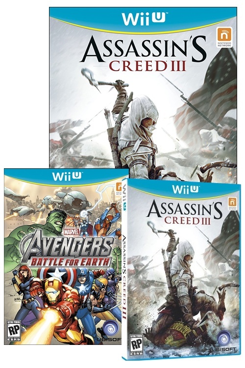
With two retailers displaying the artwork, it is likely that these are the final, or near-final designs for the Wii U's retail image. Perhaps Ubisoft placeholders. What do you think of the look?

Comment on this article

You can comment as a guest or join the Cubed3 community below: Sign Up for Free Account Login

Preview PostPreview Post Your Name:
Validate your comment
  Enter the letters in the image to validate your comment.
Submit Post

Comments

Our member of the week

Reminds furiously of Gamecube boxarts

Cubed3 Limited Staff :: Review and Feature Writer

I like it, it's different enough so there shouldn't be any problems with consumers mistaking it for the Wii, and it looks nice.

Fifa 13 (American)

( Edited 07.08.2012 15:35 by Stulaw )

Follow Me on twitter :: @Stulaw90 || My Youtube || Backloggery
NNID: Stulaw
Monkey D Super (guest) 07.08.2012#3

It do reminds a lot of the GC boxarts but I don't mind it, I wasn't expecting something amazing anyway.

Kinda wish they weren't going with a white spine again. It's just going to be confusing, and it does nothing for the misconception some people still have that the WiiU is just an updated Wii controller.

The box itself on Assassin's Creed looks blue, though this is all still obviously concept stuff. Might be interesting to get colored boxes like Microsoft and Sony do though, but doesn't Sony already do blue boxes for PS3 games? Or is that just Blu-Ray movies I'm thinking of?

Edit: And do we really need the stupid orange Nintendo Network blob on the front? We couldn't have put that on the back with the controller info?

( Edited 07.08.2012 18:36 by justonesp00lturn )

NNID: crackedthesky
My blog, mostly about writing: http://www.davidjlovato.com

justonesp00lturn said:
Kinda wish they weren't going with a white spine again. It's just going to be confusing, and it does nothing for the misconception some people still have that the WiiU is just an updated Wii controller.

The box itself on Assassin's Creed looks blue, though this is all still obviously concept stuff. Might be interesting to get colored boxes like Microsoft and Sony do though, but doesn't Sony already do blue boxes for PS3 games? Or is that just Blu-Ray movies I'm thinking of?

Edit: And do we really need the stupid orange Nintendo Network blob on the front? We couldn't have put that on the back with the controller info?

Blu Ray are a clear blue, PS3 are just clear. PS2 games were blue though, but a darker blue.

NO logos, there's too little room for art. And make the boxes bigger, fatter(put something extra with a game) and some colour - you want to attract attention to your product, not look like all the other suppliers of likewise goods.

You are not alone. I am here with you. Though we're far apart...you're always in my heart. Love u!

Make that Yellow into a Gold colour and it'll be perfect.

If we do get the light blue cases, that would be VERY good. That would stop the white spine from being confused with Wii games. I agree with you on that gripe 110%, justonesp00lturn.

Only Blu-ray movies have the blue cases, and they are clear, as was said, in addition to being shorter and thinner than a standard DVD case.

I really don't care one bit about the band at the top. I think it's completely insignificant. As long as the games (in their retail display, that is) can somehow stick out against Wii games, I will be happy.

Like video game music?!
>
Do a Barrel Roll!<

Well they will have to make it lot less like the Wii box arts as customers who casually buy games will easily mistake the Wii U boxart for a Wii game. That U shape thing they got going needs to be more clear, at the moment it just looks like some shape and not the actual letter U. As far as the box art looks like, they have a very poor graphic design department to say the least, I hope this isn't the final one to be honest, I'm still waiting for a console name change.

It does look like light blue casing on the side (in the 3D Assassin's Creed III boxart anyway), should likely be blue to match the face/differentiate it from the Wii boxes.

White on the side's fine I think; don't think it would quite work all blue. Did feel that the yellow strip should be white to tie it all together.

Cubed3 Admin/Founder & Designer
Pitfall (guest) 08.08.2012#11

Confirmed to the real deal (Ubisoft's boxes anyway).
http://www.gonintendo.com/?mode=viewstory&id=182824

Image for

Go on Nintendo, you know you want to.

I'm not keen, I think these Gamecube style tops encroach upon the artwork too much because of the colour changes - the black seen on GC titles made them far more palatable. I think the slight band of yellow alongside the blue looks feminine, it almost implies a casual Wii game. I can also see the yellow clashing with some box art.

Garish is the first word that comes to mind when I see that blue and yellow together... I guess you want people to notice your product on the shelf, right? This will be pretty hard not to spot. Intriguing that they're going with the whole Gamecube motif. I thought they wanted to get away from that.

I bet it looks better in real life.

Follow Me on twitter :: @Stulaw90 || My Youtube || Backloggery
NNID: Stulaw

Subscribe to this topic Subscribe to this topic

If you are a registered member and logged in, you can also subscribe to topics by email.
Sign up today for blogs, games collections, reader reviews and much more
Site Feed
Who's Online?
Azuardo

There are 1 members online at the moment.