Resident Evil Revelations Wii U Boxart Comparision

By Jorge Ba-oh 04.03.2013 7

Resident Evil Revelations Wii U Boxart Comparision on Nintendo gaming news, videos and discussion

It's boxart time folks, with the Japanese and European artwork for Resident Evil Revelations in for comparison.

Aside from the usual localised differences in franchise name - Resident Evil for Westerners and Biohazard in Capcom's home turf, the artwork is rather different. In the upcoming European edition we're greeted by an unsightly hand having hello through a porthole. Perhaps this particular zombie is afraid of cameras?

In the Japanese version however, the hand is replaced by the timeless beauty of protagonist Jill Valentine as she desperately tries to flee a flesh hungry zombie.

Image for Resident Evil Revelations Wii U Boxart Comparision


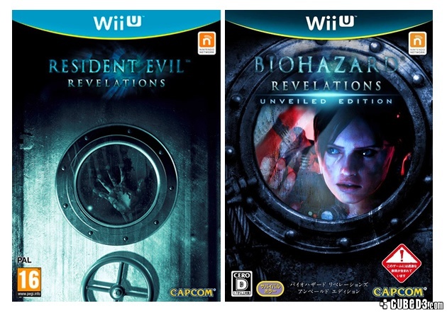
Which of the two Resident Evil Revelations boxart designs do you prefer?

Box art for Resident Evil: Revelations
Developer

Capcom

Publisher

Capcom

Genre

Horror

Players

2

C3 Score

Rated $score out of 10  9/10

Reader Score

Rated $score out of 10  8/10 (2 Votes)

European release date Out now   North America release date Out now   Japan release date Out now   Australian release date Out now   

Comment on this article

You can comment as a guest or join the Cubed3 community below: Sign Up for Free Account Login

Preview PostPreview Post Your Name:
Validate your comment
  Enter the letters in the image to validate your comment.
Submit Post

Comments

Bad Boxart: The Game.

The JP one is less bad but wow this game takes bad unappealing boxart to a new level.

Twitter | C3 Writer/Moderator | Backloggery
Image for
edwin (guest) 04.03.2013#3

I wish the japanese version was the one for all contries : ( fucking jill valentine on the cover!

Our member of the week

I think I like the clean look of the European one better.

I miss clean looking boxarts, like the classic FFs used to have in the West (namely FFVII to XII)

edwin (guest) said:
fucking jill valentine on the cover!

This is a survival horror, not an eroge (And even then, eroge don't have that kind of thing depicted on the cover directly Smilie)

( Edited 04.03.2013 10:26 by RudyC3 )

Cubed3 Limited Staff :: Review and Feature Writer
Ballbag (guest) 04.03.2013#5

I actually prefer the more mysterious-looking PAL box...not very often that happens!

The Japanese one sucks, I do like the darker coloured Wii U Logo though.

Nintendoro (guest) 04.03.2013#7

I love Wii U and it doesn't matter what the case looks like. It'll be great game.

Subscribe to this topic Subscribe to this topic

If you are a registered member and logged in, you can also subscribe to topics by email.
Sign up today for blogs, games collections, reader reviews and much more
Site Feed
Who's Online?
Ofisil

There are 1 members online at the moment.